|
Proximity and Repetition is a great and fundamental way of creating a Brand identity and forming a consistency throughout the brand that becomes recognisable to an audience or client. Repetition of use such as logo's can be great for recognising the brand and growing the company and Proximity can be a way of making a unique way of making it become recognisable. Creating A Brand IdentityMy job was to create an identity for the Brand Cedar Wheel that is a furniture workshop. Business cards are important for leaving a lasting impression on the clients so has to be simple and effective. I wanted to create two options of business cards one exploiting colour and the other playing around with grey scale and to present them both to show the contrast and essences of repetition.  Letter Heads & Compliment slipsletter heads and compliment slips are also vital when creating a brand because even the little things allow you to recognise the brand and what they stand for. Letter heads are important for maintaining a brand identity even when important things such as letters are carried out by the company. This means you have to stay creative but also allowing aspects of the letter to not be disturbed by the other contents on the letterhead. I wanted to do designs that corresponded and continued the thoughts of the two colours way from the business cards id created and add essences of the designs for them to be taken over and repeated on the letterheads. Compliment slips the same rules applied where I allowed the design of the business cards to determine how i was going to create the look of the compliment slips in order to continue to establish this brand identity.
0 Comments
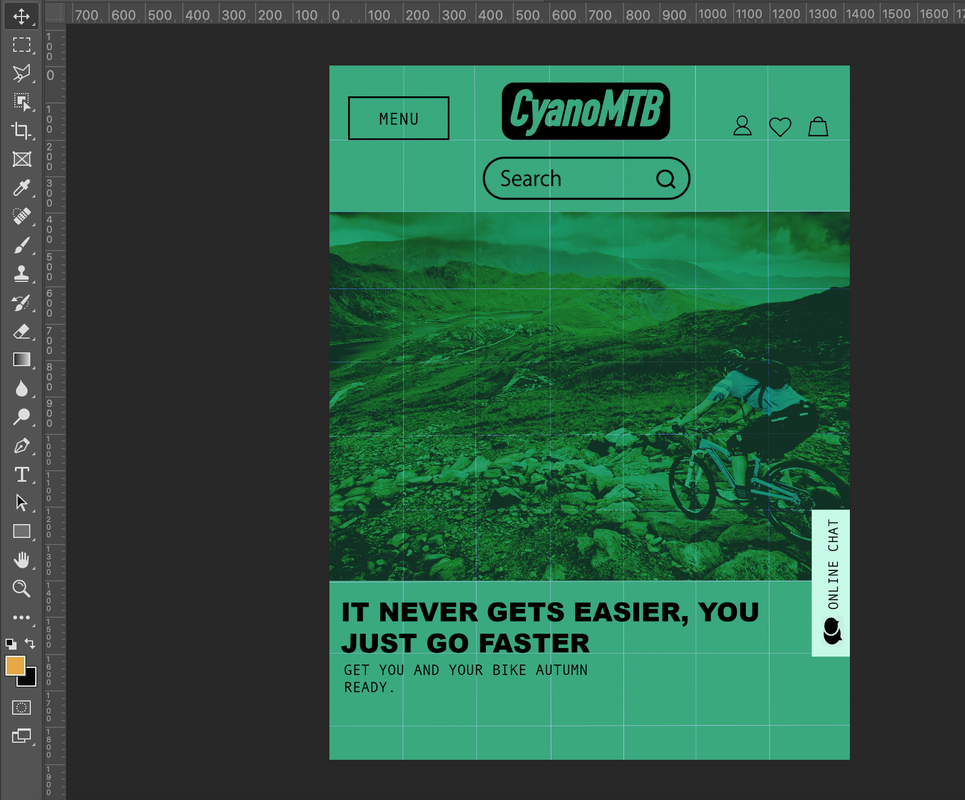
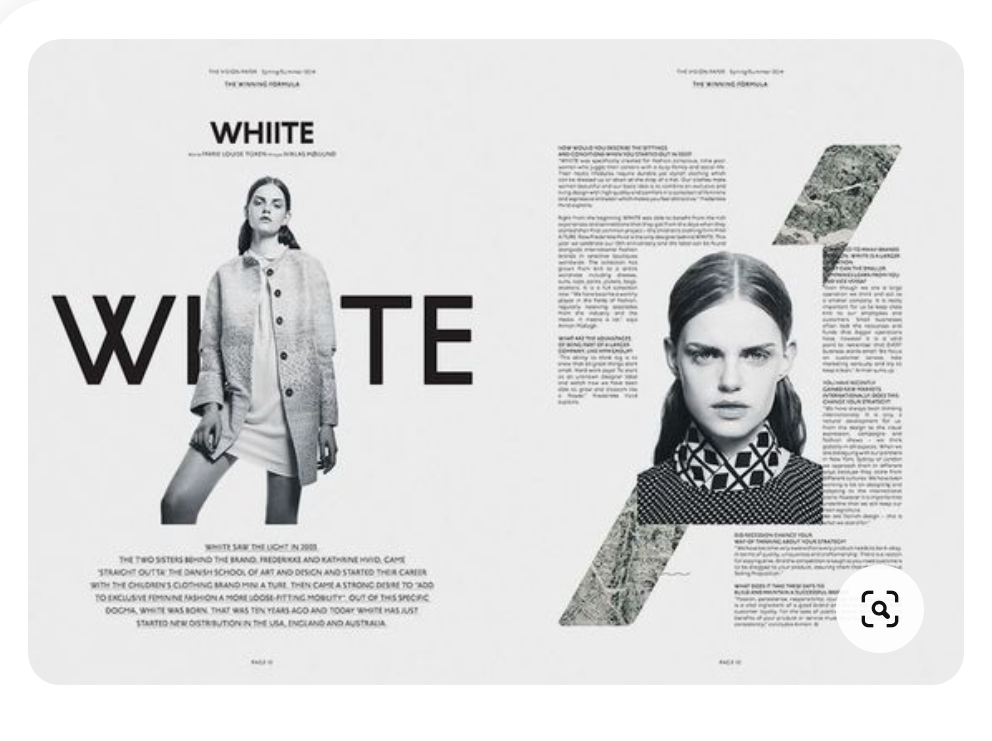
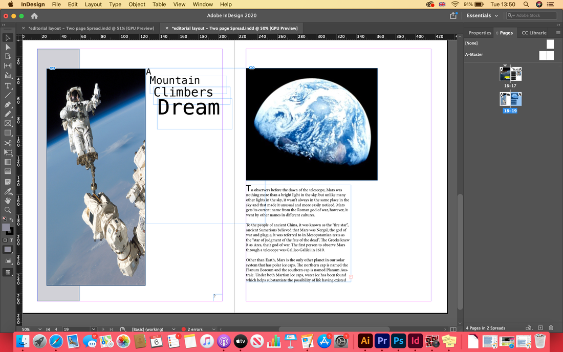
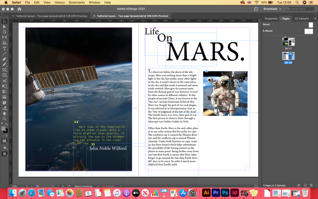
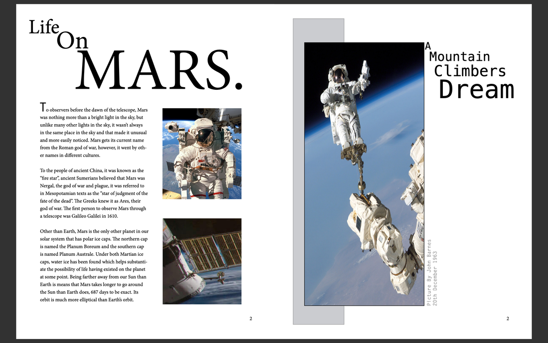
This time we're exploiting colour and how colour and balance is used to established Hierarchy and Alingnment. Our job is to exploit colour for a bike company app that is innovative, interesting and captivating for the lints and audience to read. I wanted to document my journey doing so. I felt like the colour green really tied into the subject matter and captured what its like to be about with bikes along with earthy colours. I wanted the colour to be the main substance and almost like a brand identity of the brand Cynamo Bikes and be instantly recognisable to the brand. I begin to put in my gird and began to add my key elements such as my logo, my search engine and menu box with built in navagation. This was a strategy that I continued to do them critical things on to each brand to ensure continuity and brand identity.  Final products and OutcomesI realised by the colours and the background being too close a colour to the other aspects of the app that it blended in and allowed to not establish hierarchy. After taking a look at other sites started to look closer how I can make it more of a unique site with fundamental principles of an app. I decided to make the colours more appropriate for the app and make it look more professional but still remaining the idea I had. I wanted to make and app that was eye catching and allowed interactive functions too engage with the customer with their wants and needs to improve the company as well as the online functions Contrast and negative space play a massive part in the fundamental elements of graphic design. Contrast can be tonal or on a relative scale of design elements. it can although become overbearing in contrast with type and lose engagement with the viewer if done poorly and not done effectively. Colour contrasts can be effective using opposite ends of the colour wheel to create a creative and unique outcome. negative space can be a very good way of drawing attention to a photo as well as having a unique way of displaying the text pieces/typography. Relative scale and negative space can definitely establish hierarchy and level of importance. for magazine spreads like the one we have to create, splash spreads are great for not disturbing the image. low content is often a common feature in things such as skater mags because it calls for being experimental. My Task - MarsMy task is to create a two page spread that for a magazine on an article that is about mars. this must include both hierarchy & layout as well as developing ideas for contrast and negative space. I want to drag notice towards the pictures of mars as well as experimenting with typefaces to ensure that the subject matter is explored to its advantage. I went on to InDesign to create my two page spread piece. I wanted one of the pages for my first development to be dominated by the picture and a part of text. To establish hierarchy and level of importance I wanted the word mars to stand out to let the client know that the spread is about Mars. I felt too that this was the perfect opportunity to bring the dark quote in too at the bottom of the page. on the second page I wanted to use a lot of squares and create some geometric dimension that ties in with the theory of mars too and bring them behind the pictures to create interest. As well as that, I wanted to create some negative space among the page too allow the body of text to not be disturbed by anything else. Development My Ideas At First I came up with visions for the splash page but I felt that this weren't successful so I decided to dive in a bit more. Splash pages need to be done correctly and to a certain standard and I decided to play around with a different idea to make for the other pages. I wanted to make my splash page good, but also have some correlation between the splash page and the turn pages so that the audience know we are look at a coherent piece. Here is the piece I weren't too happy with that I decided to change according.. I went on to tweak my ideas and start creating my turn page. I made boxes behind the pictures to allow them to pop in comparison and used the remaining pieces of body text go nice in line with my layout columns and grids I had made earlier. I made sure my leading and body size for me pieces of Boyd text were appropriate and good for the purpose of the magazine spread. |
Cloe MorrellFollow me through my second year as a Graphic Design student producing some marvellous creations! Archives
August 2021
Categories |


 RSS Feed