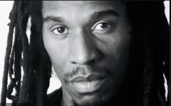
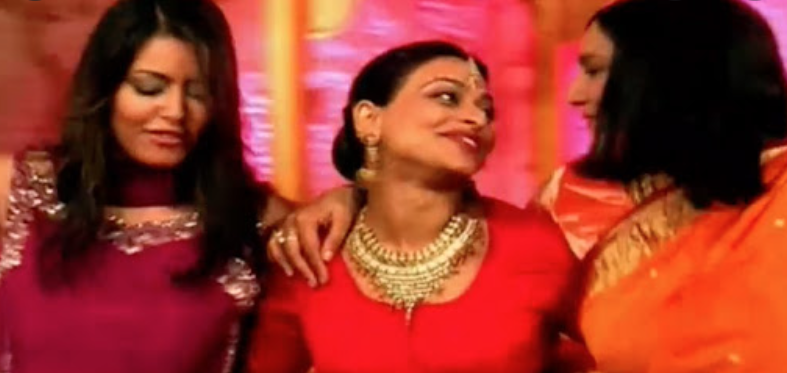
Typograohical Book DesignTypographical book design is something that I believe is and arts within its self. it can range from being really neat and precise to being very free handed and as though it had been hand written and have a really unique quality to it. These are some book covers I have found to be quite effective and what I would love to create myself. Photographical Book CoversI love photography and the power that an image brings. Unlike Typographical book covers I feel that if you have a powerful image type goes hand in hand with creating a unique and intriguing book cover. Photography has a power of displaying messages and is crucial to captivate the right audience for your book. Illustrative Book CoversIllustrative Is similar to photographic front covers how ever are vastly different. Working in hand with an illustrator when making a book cover could probably be a lot quicker and easier to get visual outcomes than trying hard to get the perfect picture for a front cover. However because of the style that illustration creates this could cater for a younger audience with its style. Audiencesin order to reach a certain audience you need to look into what appeals to such target audience in order to capture their attention. Affluent audiences usually go for a more proffesional and sleek style because of their class and status. Fast Celebrity news distributions like the sun are for chaotic displays and loud colours as well as a certain tone of voice to inform their chosen readers and its important to design your piece effectively to not only suit your audience but be liked by a mass audience that allows for your audience to become larger.  Talking Turkey's - Dub PoetryTalking turkeys is a collective of poems for a particularly younger audience. I wanted to capture and captivate this certain audience and would have to do so in an order of ways such as colour codes, language and engagement and show some familiartiy for a younger audience to appeal to. Benjamin Zephaniah is a slam poet and Rastafarian who is was included in the Times for being in the top 50 post war writers in 2008. His unique style of dub poetry means he performs his poems over the beat of reggae music and uses his poetry to inform people of today to make a change. Here are my initial ideas for the talking turkeys book. I want to incoperate the turkeys and almost play on the rasterfarian aspect and allowed that to go through on to my design. I want it to be simplistic yet effective. This one for me has got to cater for a younger audience as well as be good for parents to approve of and is something definitely to consider in the design.  Here I made my own drawing and interpretation of a Rastafarian turkey and allowed it to be more exciting by adding this graffiti style writing and paint splurges. I wanted to create a book cover that was fun and appealing for children.  Final ProductI felt like the splats showed continuity and allowed the type to dominate the title instead of the Turkey and changed the back body text so that the subject matter of the Blurb/synopsis is for the ideal intention and fits to the chosen target audience that is children.  The Unihabitable Earth - A book on climate changeThis book is about the future and how it will probably be shaped with the way we are going with looking after it. I want this to be quite futuristic and use photographic elemetns, but as i thought on maybe i could really experiment with type. David Wallace Wells is an American journalist known for writing about the effects of climate change. This is a book aimed for someone with a more academic background and with more or a drive to learn and be more intellectual. This is a topic for a specific audience and has to be reflected in the design.  These are the colour schemes that instantly drew my attention and initial thought to what I think the feeling of this novel would be   Final ProductHere is the final Product of the uninhabitable earth book. I lightened the Quote so that it stands out in amongst the black stark background that was appropriate for the subject matter. I felt like this book cover worked well for the purpose and intent  Life isn't all Ha ha He heThis is a book based of the comedic show of bbc and i wanted to captivate the essence of it through design. This is catering to not only a specific ethnic group but is trying to broaden peoples understandings and clear up the myths about their culture and wanted this to be shown through type This book is based on the bbc a comedic series about an Indian woman living in the lively London and is all about Family, Friends and decete. Not only does this cater to a specific ethnic group but this has to cater to others and teach them and give them the understanding of their culture and this has to be reflected on the book in an effective way.  Following on from my initial ideas. I wanted my designs to be quite typographic to push the norm of this book cover but however allow aspects of India culture such as the henna designs to run through it to show familiarity.  I wanted to experiment and allow the book to shine more by adding more elements to the cover before I started to add in things such as the blurb and quotes  Final ProductI changed the Font of the 'Life Isn't Always' and changed it to Ariel black like the HAHA HEHE although changed the treatment of it so it stood out in comparison to the rest of the title. I wanted to continue this patchwork style over the whole back, spine and front cover so it would all be considered together and added this organic flow to the whole book 
0 Comments
|
Cloe MorrellFollow me through my second year as a Graphic Design student producing some marvellous creations! Archives
August 2021
Categories |


 RSS Feed