|
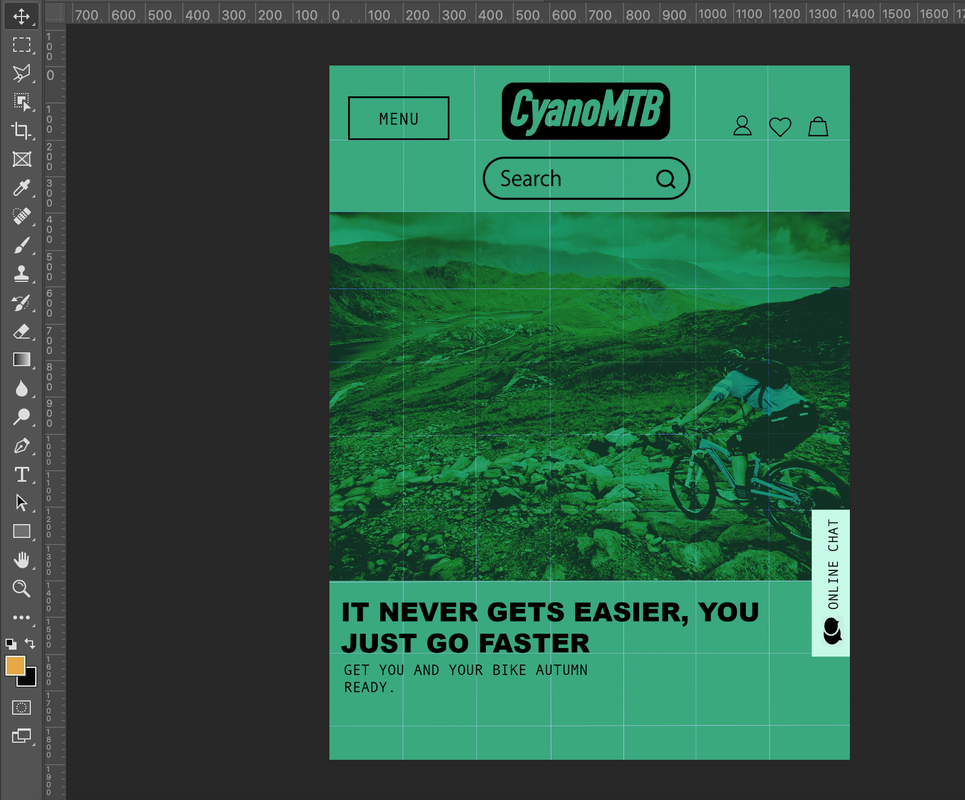
This time we're exploiting colour and how colour and balance is used to established Hierarchy and Alingnment. Our job is to exploit colour for a bike company app that is innovative, interesting and captivating for the lints and audience to read. I wanted to document my journey doing so. I felt like the colour green really tied into the subject matter and captured what its like to be about with bikes along with earthy colours. I wanted the colour to be the main substance and almost like a brand identity of the brand Cynamo Bikes and be instantly recognisable to the brand. I begin to put in my gird and began to add my key elements such as my logo, my search engine and menu box with built in navagation. This was a strategy that I continued to do them critical things on to each brand to ensure continuity and brand identity.  Final products and OutcomesI realised by the colours and the background being too close a colour to the other aspects of the app that it blended in and allowed to not establish hierarchy. After taking a look at other sites started to look closer how I can make it more of a unique site with fundamental principles of an app. I decided to make the colours more appropriate for the app and make it look more professional but still remaining the idea I had. I wanted to make and app that was eye catching and allowed interactive functions too engage with the customer with their wants and needs to improve the company as well as the online functions
0 Comments
Leave a Reply. |
Cloe MorrellFollow me through my second year as a Graphic Design student producing some marvellous creations! Archives
August 2021
Categories |


 RSS Feed