|
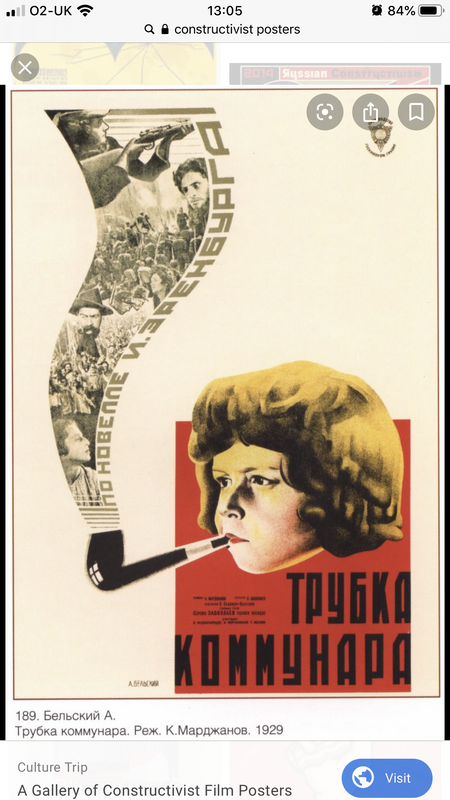
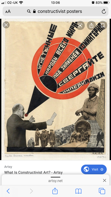
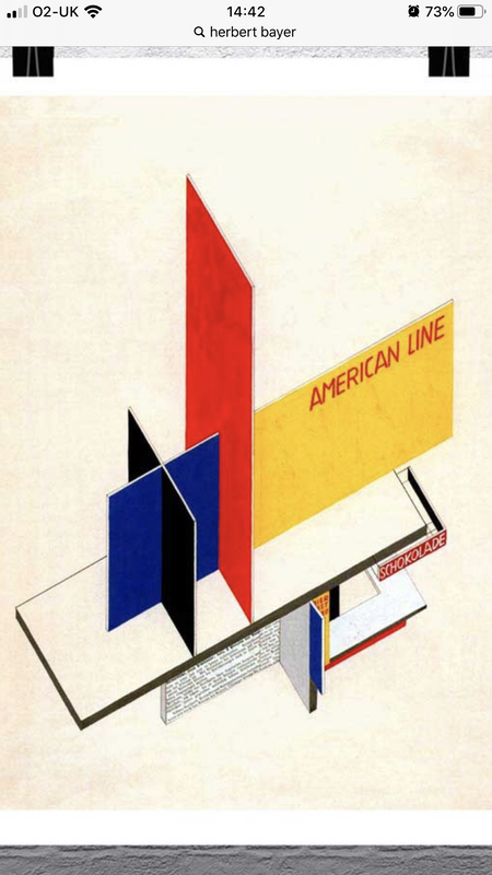
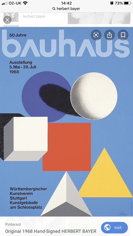
With their bold colours, perfect geometric shapes and distinctive typography constructivist film posters become the 'new art' form in the young soviet country shaken up as a society and subsequent civil-war. The leader of the Russian Revolution, Vladimir Lenin 'of all arts cinema is the most important', this led poster designers and film producers to be constantly on the search for new and innovative content that would captivate the nation in a informative yet artistic way. in the 1920's and the beginnings of the 1930's was the most important period in Soviet film poster history. 'Sovkino' a government owned production company had an entire department dedicated to film poster design and employed many famous artists from the Straganov school of applied arts. Stenberg brothers were probably the most famous designer duo in Soviet Russia as they designed over 300 movie posters together, many of which are now considered classics. They were so captivated by Russia because they were seen to be 'ahead of their time'. these designers used their knowledge of lithographic painting and their individual knowledge to mitigate the poor quality of early 20th-centuary painting. These two posters are similar in the way the typography is cascaded and displayed on the page. The projectory of the words on each of the posters appear slightly different as the first is more relaxed and subtle in contrast to the other that appears urgent and abrupt, however the way the typography is displayed in this very innovative and creative way, shows the impact and important of these words. The girl is smoking a pipe, embellished in the smoke are pictures of serious issues that were going on is Soviet Russia at the time. This could reflect maybe the class or desensitisation of many people of the subjects as she is unphased to be causing a lot of damage. This could also be a reflection of the industrial state too that is effecting the way the lives of the Russians have changed which had then affected the content of film and early forms of television. In the second the words are projected out of the speaker to show the movement and force of the words as well as create the sense of yelling. This is directed too at workers and possibly the lower class. The sense of red on both of these stand out in amongst the white/cream background and is an effective colour to get attention and spark interest to the poster. This colour could also signify danger and closely link to the danger of the issues raised from these Russian film posters. Overall I think designers like the Stenberg brothers had the perfect oppurtunity to create art that people had never seen before and captivate a new audience with even a new style. Because film was also such an important aspect as it still is today, it is important that designers like the Stenberg brothers were creating stuff that were ahead of their time in order to be a success. Herbet BeyerHerbet Beyer is a celebrated twentieth century Austrian American versatile artist. he went down many paths such as graphic design, sculpture, architect and painting. He was considered the last living member of the Bauhaus and caused a lot of seminal development of the Atlantic Richfield Company's corperate art collection.In Linz he was apprenticed to the artist Georg Schmidthammer. He withdrew from the apprenticeship in favor of studying at the Darmstadt Artists’ Colony. He was fascinated by the Bauhaus manifesto by Walter Gropius.Later he was appointed the director of printing and advertising by Walter Gropius.He also tried to design typeface based on simplified phonetic alphabets.Herbert Bayer skills thrived under the supervision of some of the Bayer adopted the reductive minimalism method for the most Bauhaus publications, employing all-lowercase, sans serif typefaces. Similar to the other typographers of his time, Kurt Schwitters and Jan Tschicold , he also tried to design typeface based on simplified phonetic alphabets. Otl Aicher Otl Aicher were a German Grapic designer and typographer. He was most ronouned fr his pictograms and famous and extremely iconic designs for the 1972 Olympics held in Munich. His designs had a major influence on Graphic design at the time and has made such and impact that it even is reflected in the work graphic designers do today. Besides this he was also the co-founder of the Ulm school of design. Born on May 22, 1922 Aicher grew up in Ulm and worked alongside Werner Scholl who later on became the Werner Siblings who were executed by guillotine for being a part/members of the White Rose. The Werner family let Aicher hide in their residence and after the war came to a halt in 1946 the following year Aicher launched his own studio and in collaboration with his wife and Max Bill he established the The Ulm School Of Design. Aicher had a keen interest in Corperate branding and identity. He was often requested to design things such as airline logos and his most famous was the lead design role in promotion of the 1972 summer Olympics. Reviewing the '64 Games Design he based his work partially on previously employed iconography and created a set of pictograms. These pictograms were developed with an intention of presenting a visual interpretation of the stadium featured in Munich. These pictograms were designed to help athletes and the publics identify which sport they were watching and have becae ever since the go to symbols for identifying and signifying their chosen sports, as well as making a universal typeface for the Olympics. In his later career, Aicher ocnsulted the kitchen company Bulthaup and developed Rotis Font Family. He also continued to show his passion for design and typography and wrote a series of books on his discoveries of being in the industry that was heavily evolving. His well known works include, The world as design, inside the war, the kitchen is for cooking and critique of the automobile. A Reflection On Modern DayRichard Hamilton was an English painter and collage artist. His early works and projects such as this collage of his 1956 collage 'Just what is it that makes today's homes so different, so appealing?' were considered by many people to be among the earliest works of pop art. He wanted to make sure that in his collage he reflected all the social, political and historical contexts that was happening during this time period to be portrayed in a bold and comedic manner through his work. imagery that fitted into Hamilton's categories were sourced and found from a a stash of American magazines that a fellow friend and artist McHale had brought back from the United States. These things he specifically chose to feature in his collage reflected Hamilton's ironic interest in popular culture and modern technology. The collage includes early inventions such as theadapting the look and feel of Tv's and tape recorders that would of been considered state of the art in the 1950s in contrast to now that would probably appear out dated. Framed comic strips put in between a traditional nineteenth century portrait and a window looking into a movie theatre shows it belonged to a past era. The representation of women and men are vastly different to what they could be seen as now, as the 'pin up' woman is placed and shows women still in this objectified and sexualised light as women were very much part of a male gaze. However men, this aspiration and dream to be a hypermasculine with a heavily toned physique has still remained a trend even now, despite people becoming more accepting of other looks and frames. 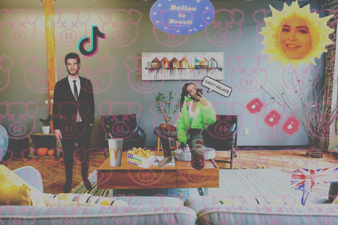 I wanted to create a collage of my own where i reflected the views, idealisations and contexts of todays society in a modern and digital collage. The depiction of men and women have slightly changed due to the changing in equality and the values of men and women becoming more on par with each other. However there is still this expectation to look, dress and act a certain way to be 'liked' I wanted to remain that a obvious aspect within this piece. Although England has been going through a massive political and environmental struggle and I could of made it a little louder and obvious about the brexit crisis, I wanted to subtly make hints around the room and England and how this has been an extremely tough time as well as America. Other aspects such as social media and memes i wanted to incorperate so I livened up the collage. The rise of the app 'tictok' has become a viral hit across the globe helping us during these hard political stuggles as well as the great sun with Kylie Jenner in the middle was a well circulated meme of her singing to her child Stormi. This was seen as hillarious across the world as Kylie Jenner being a part of the Kardashians (a very idealised and famous family who people often aspire and compare themselves too) was very much 'out of the ordinary' for someone of that status to be showed up that much on social media platforms. Iconic pig symbols cascaded across the collage as this were the symbol and logo for the collaboration of Shane Dawson and Jeffree Star's make up launch that record breakingly 'broke the internet' for days on end and showed it's most highest sales in the makeup industry yet which is a big renouned achievement. Lastly i wanted to loosely add things such as instagram likes in to this collage to show this obsession for status and this hierarchy that comes with social media and this desire to be the 'perfect' person and have this lavish lifestyle which still today is very much a high topic on everyones brains in this youth culture.
0 Comments
Leave a Reply. |
Cloe MorrellA goofy and fun Graphic Design student playing and messing around with art and design. Archives
May 2021
Categories |


 RSS Feed