|
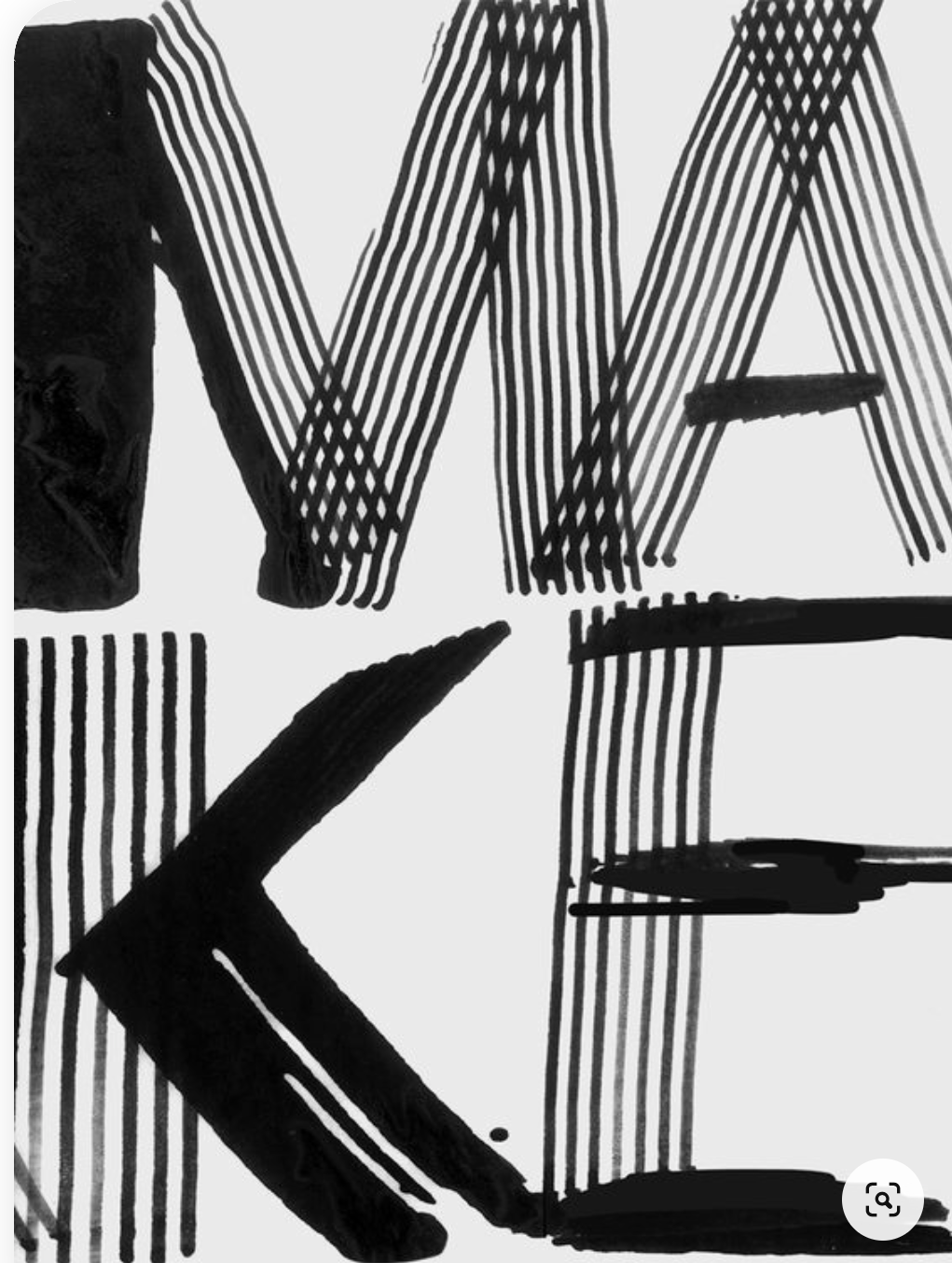
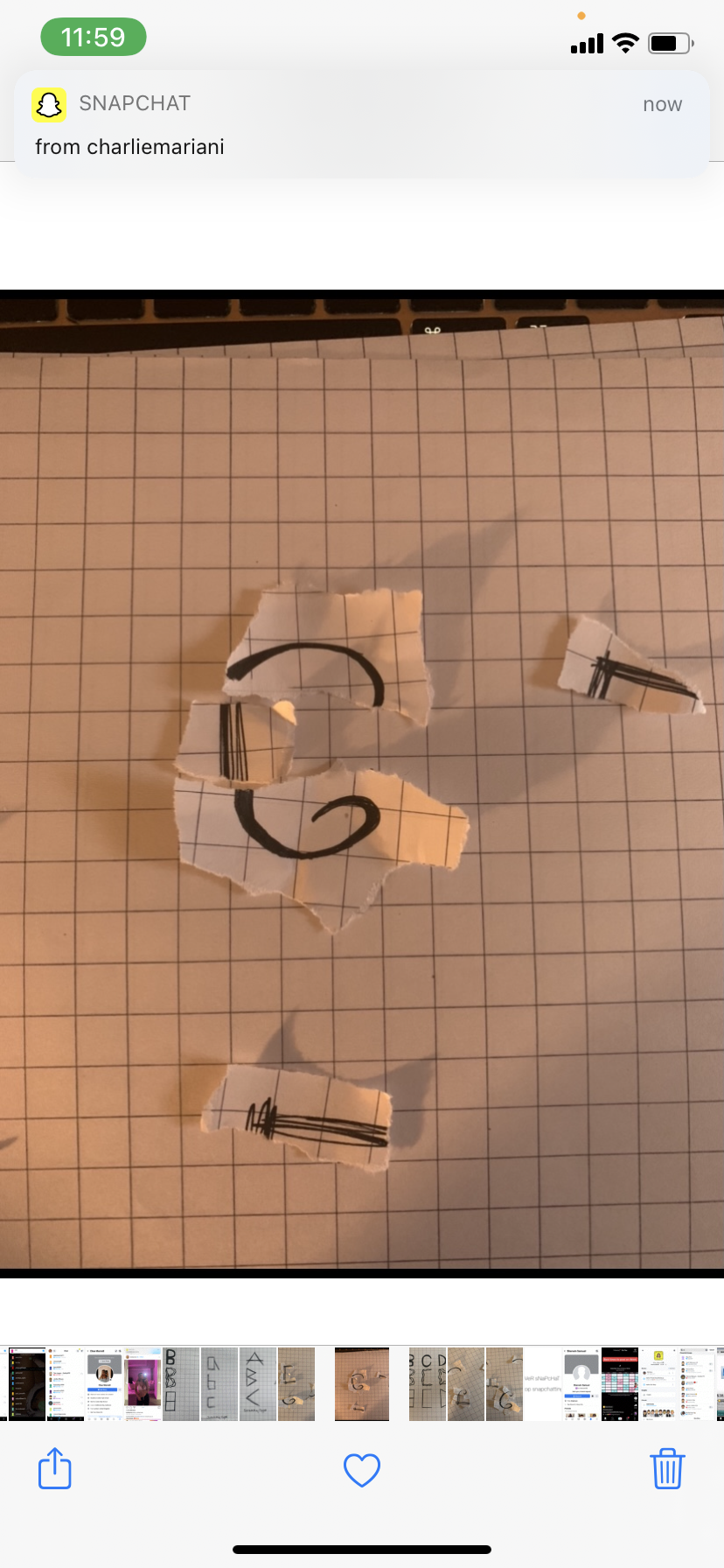
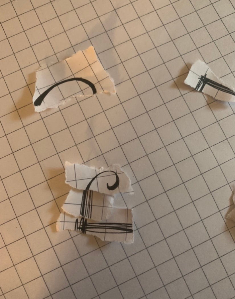
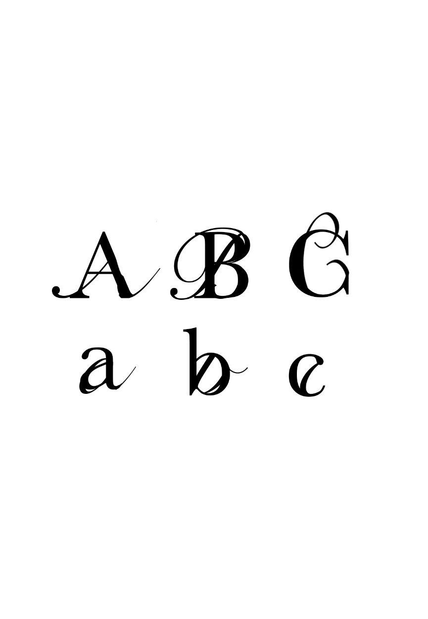
Migration to me is about movement and flow and when I Incorpperate that into my typography I want it to be easily distinguished. internal migration: moving within a state, country, or continent. external migration: moving to a different state, country, or continent. emigration: leaving one country to move to another. immigration: moving into a new country. return migration: moving back to where you came from. I wanted to think of how I could show migration through typography in a way that was unique and a version of my interpretation. I found it interesting how we associate different pieces of typography and there style with a country or common fonts are displayed in that country that then become easily recognisable to us as theirs and made me think how that would look if the combination were blended. Initial SketchesI started to put my visions down on paper and start to visualise how I want my type to look like. using grid structures makes it easier to form out a typefaces and gives you a structure to work from. these are ideas of what I initial though to be cool concepts. I thought that with migration includes the different countries and how we distinguish even countries to the way/style of the typography we see around. This intrigued me and allowed me to explore further with the idea of merging the ideas into a way that created a whole new type face. I decided to play around physically with letter forms and seeing the idea of forming them together and how it would work before putting it into photoshop and illustrator to do it in a software format. Putting My Ideas On ScreenI decided to then play around in photoshop and blend in separate fonts together to see how this would work. I allowed to continue myself to look at fonts we associate that with other countries and to see where I could go in changing that to how I would represent migration as a whole. Starting to make my fontI decided to go through and merge some existing fonts together as a trial period and see how the process works out. This allowed me to develop a love for the curves and 'swooshes' of some of the type faces and I felt that the fluidity and freeness of some of the type faces I've discovered and felt that was another factor. Final Productshere is one of my completed versions of my migration typeface. I Incorperated the blend and emerging of typefaces and added a more crisp and structured font like Baskerville to be merged with a typeface that were a lot more free and had a lot more of a flow and curl to it like Snell Roundhand to create a typeface with much more movement and expression. Typefaces with a lot more movement is something I could picture to demonstrate for migration because of how the definition of migration is all about movement too. Migration - Type TwoMaking a PosterMaking a promotional poster to advertise and show a playful side of the typeface you have made is crucial. I wanted to make a poster that is simplistic and clean but also playful and showcasing the font that I have made. These are a few inspirations that I looked up to. I like the way they showcase their type as well as using essences of scale and colour to make it playful and interesting.
0 Comments
|
AuthorWrite something about yourself. No need to be fancy, just an overview. ArchivesCategories |


 RSS Feed