Here is where I will be experimenting and using the influence of other peoples work to inspire me into making the pieces that I do create. Artists creations are a reflection of their identity and their thought process. to start me on my thought process and give me a clear indication of what i want to do for my briefs, I use the influence of other peoples work and practical techniques to discover and inspire me to do work that pushes me out of my comfort zones to do pieces that are very innovative and creative.
Essay Research
I have chosen the topic of 'social media'. This is something dear to my heart and it interests me how it has changed the dynamic of society and I want to outweigh whether the impact of social media is negative or more positive on our society and our future generations.
Netflix Documentary - The Social Dilemma
As one of my sources to gain great insight if the world of social media, this documentary hugely opened my eyes to not only the moat but how social media is hugely driven by ad revenue and almost using us as the consumer and getting us hooked and addicted to scrolling and interacting online.
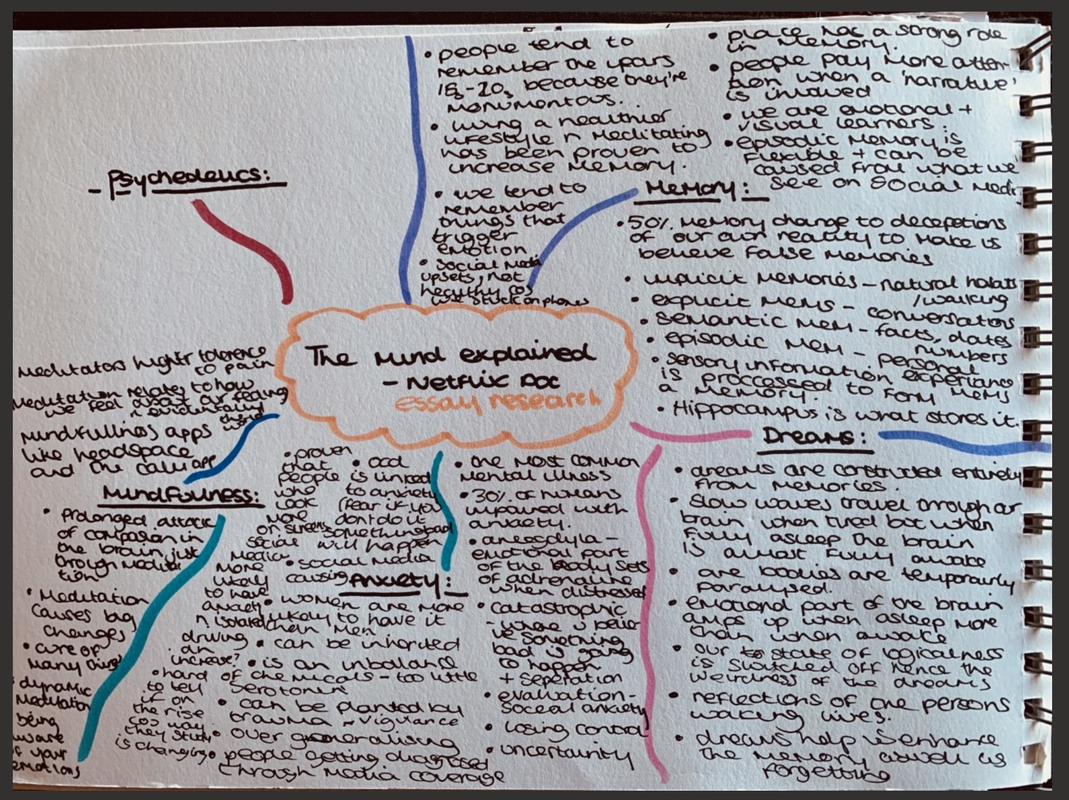
Netflix Documentary - The Mind Explained
Photography & further research - unfiltered & natural Vs filtered & posed
Here are some notes on extensive research I did, alongside the essay I want to explore how photography and post production/editing plays a major part of social media and creating this 'hyper reality' where we can't differentiate the real and the edited leaving often this false perception of reality.
'Bodies That Matter' - Guido Castagnoli
Reinventing the masculine discourse - William Lakin
Unfiltered & Posed Campaign - Holly Hagan


Magazine Design
For a current project I have to research and going into the world of magazine design. Magazine Design is crucial for following a grid with columns of usually 6 as well as staying creative while following the rules and remaining formal. With my project I have the theme of migration that I have to create an article about and show case my knowledge of magazine layout and design to create a great Splash and turn page for my chose article based on the idea of migration.
Migration - How I interpret It
Migration is a very loose term and is up for interpretation as to whether you want to interpret literally or in a more deeper sense. I wanted to evaluate and discover the possibilities and factors of why the rate of migration has risen over the decades or whether it has declined and the reasons for this happening through research and reports taken by The United Nations. This is something that intrigues me and is subject that can be fascinating for others to find out as well as the photography could be interesting to feature in the article as I will use some for different decades and periods of time to show the differences and changes with how migration was and how it is now.

Layout & Collumns
Layouts important in the world of graphic design and having knowledge about a grid and columns is very important for ensuring your alignment and placing is perfect in order to appear correct on the page. This also establishes hierarchy and allows you to keep boundaries and fit all of your information on the page. I have been given the task of doing them on a 6 and an 11 column grid and we'll see as we start to play around with designing if this alters any of the process.
Developing Ideas
Here I am starting to look at ideas for my pieces and playing around with placement and hierarchy to see what would work best when it comes to making final decisions. Playing with photography and how the placement can establish hierarchy is very important especially on a splash page. Turn pages however photography is used in different ways however for the splash I am looking at how photography as well as type can play a massive part on how successful your article can be as it must be striking and enticing enough to allow the reader to continue on to the splash page.

I kept messing around with different features to see how well and successful these things would turn out and here is one example of a mock up I found to be quite effective. This has given me an insight as to what can work and I might incorporate for my final pieces. Using colours too that are found in the photography and translate them colours through type shows the relationship between the two and shows that they are both a part of this article and I want to establish that further into my final pieces.

When it comes to the turn page you can have more chance to play around with pictures and a lot more body type as this is the main page where the majority of information comes from. This page has to be ensured that it has some resemblance to the splash so the reader knows this a continuation of pages about the article.
Final pieces
I wanted to keep my final pieces in the same style however using different techniques on both the splash and turn page to create a different yet good effect to keep the reader to want to keep reading more about the article. I wanted to really use the photography and let it do the talking as well as exploring negative space and how that appeals and allows you to steer you through and admire the rest of the article elements. I tried to do two different approaches to see what appeared out best,
11 column Migration Article
6 column Migration Artcile
Front Covers
I wanted to create two front covers that reflected different audiences. The first one I chose to kale is a conventional magazine and the one is a lot more for niche audience and plays on that part of being and old, historic and traditional. I wanted to display this to show the contrast in how a magazine cover looks all depending on it's audience.